


Here at Hightower Graphics we will help you with all of your printing needs from conception to delivery. Our designers (hey, that’s me!) will work with you to create anything you want from business cards to banners. Many of you will have your own files designed and ready to send to us, and that’s ok too. Here are a few tips to help you prepare your files for commercial printing to ensure that your final printed product looks just like you envisioned it.
Download our Art Guidelines to help you along the way.
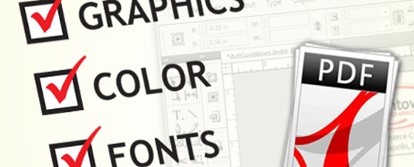
Image Quality
First things first, make sure all of your graphics and images are high quality before you use them in your design. Don’t ever use images saved off of the internet! Almost all images found on the web are too low quality for commercial printing. So when you right click on an image and save it to use in your next brochure, don’t expect it to look good.
Color
The second thing to keep in mind is color. Before you start designing, decide how many and what colors you want to use. All print jobs are going to fall into two categories when it comes to color: Full Color (CMYK) or Spot Color. If your design is full color, design away! Spot colors are used when you only want 1, 2 or 3 colors and can be selected from what is called a Pantone color chart. Most companies choose two or three colors and then always use those same ink colors to create consistency throughout their materials. If you want to use spot colors, make sure everything in your document only uses those colors. Mixing spot colors and CMYK colors can cause some unpleasant issues with your files. Don’t worry if you don’t know what your company spot colors are. We’re here to help. Your sales representative can bring out a Pantone color chart for you to choose from.
Fonts
Fonts are notorious for causing problems with design files. Not every computer has the same fonts installed, and when they don’t the computer will usually just substitute a different font for the one you used. It’s quite annoying. The best way to combat font substitutions is to convert all of your text to outline or curves. This just means that your software will change all of your text from “type” into graphics. And that means no font errors.
Last but not least, save your design as a high resolution PDF and send it to us. Most all software has a way to export to a PDF, just make sure you use the highest quality settings. If you don’t know how to create a pdf from your software just give us a call and we’ll help you figure it out.
If you want more specifics on how to prepare your files for commercial printing check out our Art Guidelines. And remember, we’re here to help you. So don’t hesitate to contact us.
Happy Designing!
Share this Post